Dec 20, 2011

Kim-vertising

Hot on the heels of other fallen dictators and terrorist leaders who have recently died, we have the passing of North Korea's "Dear Leader" seeing out the year (although there is still about a week and half left this year for Ahmadinejad, Mugabe or Castro if they want to join the list).

Following my previous blog posts on Bin Laden's Legacy in Advertising and Gaddafi in Advertising, it's only fair to look at "faminist" Kim Jong-il's image as used in advertising (primarily print and posters here).


International Society for Human Rights (ISHR)
Ad Agency: Scholz & Friends, Berlin, Germany, 2009.

Celebrating 60 years of the ISHR promoting human rights, the anniversary cakes were "shared" with various leaders of dictatorships around the world, including Kim.


ISHR
Ad Agency: Ogilvy, Frankfurt, Germany. 2010

The ISHR more recently also had a campaign showing world dictators scared of the modern mouse. This particular ad is poorly photoshopped but still conveys the intended message.


S-K Bedding & Mattresses
"Who says there's no rest for the wicked?"
Ad Agency: Publicis, South Africa, 2004.
SK Bedding and Publicis used North Korea Freedom Day, April 28, 2004, to help promote their product.


Nulaid Eggs
"History's produced a lot of bad eggs.
Thankfully, ours are always good."
Ad Agency: The Jupiter Drawing Room, South Africa, 2007.

Also from South Africa, Nulaid Eggs uses Jong-il's likeness in egg form to illustrate a bad egg.


Amnesty International
Ad Agency: Contrapunto BBDO, Madrid, Spain, 2008.


Amnesty International
"See no evil?"
Ad Agency: LINs, Malaysia, 2008.


Amnesty International
"Your signature has the power"
Ad Agency: TBWA, Paris, France, 2008.

2008 saw a volley of ad rockets fired by Amnesty International against North Korea's supreme leader as well as others.

Contrapunto BBDO used the fly on the nose (using Amnesty's logo) as a symbol and visual metaphor for human rights abuses which is as plain as the nose on their face, right in front of these leaders' eyes and yet never quite visible to them.

The campaign from LINs in Malaysia is not quite as clear. It uses the recent optical illusion meme of staring at a point (in this case a red crosshair mark) for several minutes and then looking at a white surface to reveal a face illusion. These directions aren't given in the ad and therefore assumed that people know what to do when viewing it. Also there is a tenuous link between this and the ad's message ("See no evil?") which may have been somewhat lost in translation (?).

The final ad here, by TBWA Paris, is the most clear and powerful (and also featured in my Gaddafi blog post).


Reporters Without Borders
"Only a free press can hurt them.
Support our fight."
Ad Agency: Saatchi & Saatchi, Paris, France, 2010

Reporters Without Borders and Saatchi & Saatchi Paris put together a campaign last year which reverts to the visual metaphor of a crushed press image of global dictators.


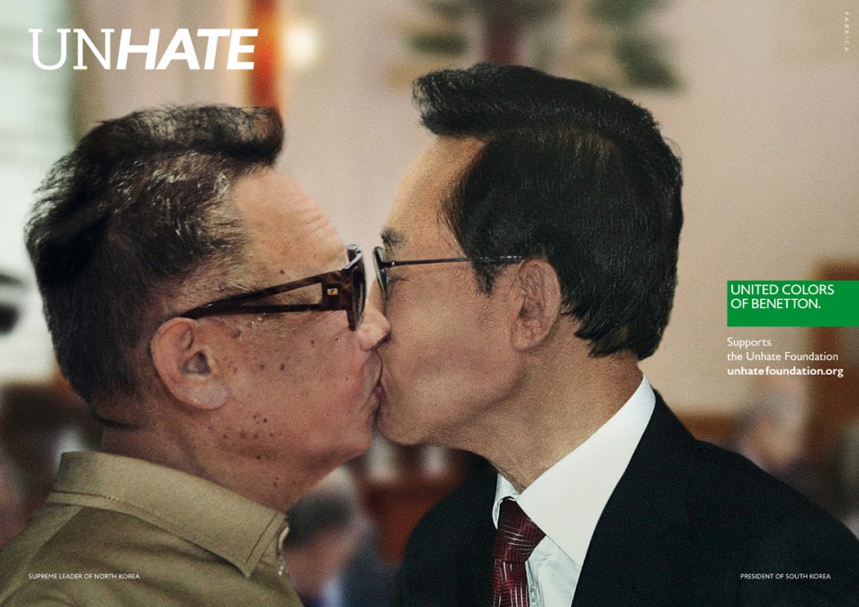
Benetton, "UNHATE" campaign
Ad Agency: Fabrica, Italy, 2011.
Benetton's recent "UNHATE" campaign, was able to manufacture a final kiss (kiss of death?) between Kim and South Korean president, Lee Myung-bak. This was an interesting campaign featuring several adversarial world leaders in intimate positions.


Amnesty International Portugal, "Tyrannybook" app
Ad Agency: Leo Burnett, Iberia, 2010.

Kim Jong-il profile, Tyrannybook.
Tyrannybook, a digital app designed and implemented by Leo Burnett Iberia in for Amnesty International Portugal in 2010, This was a social network (which has since been discontinued) dedicated to the surveillance of some of the most tyrannical world leaders that violate human rights.

Modelled on the look and aesthetics of Facebook, both users and the organization can update leaders' profiles on their most recent abuses. Users could also link up as allies and participate in group discussions, exchange points of view and discuss current events.

While this app has now expired, it may have been a foretelling of the role Facebook would play in the 2011 Arab Spring uprising through the Middle East.


With Kim Jong-il kicking the bucket, advertisers now have one less dictator to use in their messages. 2011 has been a terrible year for oppressive global leaders.

Oct 20, 2011

Gaddafi in Advertising

As a follow-up to my Bin Laden Advertising Legacy post a few months ago, here's a look at the just recently deceased Moammar Gaddafi and his appearances in advertising.

Amnesty International
"Your signature has the power"
Ad Agency: TBWA Paris, France.
Amnesty International France used several dictators in this campaign to illustrate the power of a signature.


International Society for Human Rights (ISHR)
Ad Agency: Ogilvy, Frankfurt, Germany
Following on from Amnesty's campaign, this campaign for the International Society for Human Rights shows modern dictators such as Gaddafi scared of a mouse (the clicking kind).


Gulf News
"Perspective. Irrespective."
Ad Agency: Derek & Priti, Dubai, UAE
Dictators have been all the rage this year in the Middle East. And what better place to read about it than in Gulf News.


France 24, "The Tweets"
Ad Agency: Marcel, Paris, France.

A parody of Alfred Hitchcock's "The Birds" film poster. French international news channel, France 24, compares the bringing down of Gaddafi's regime by viral social media to the menacing birds in Hitchcock's movie that send a town into chaos.


This was accompanied.by a 3D animation / viral video to help promote the station's new twitter feed and it's role in the Arab Spring.


Lifebroker
Ad Agency: McCann Erickson, Melbourne, Australia
Tongue-in-cheek ad by Australian life insurance firm, Lifebroker. If only Moammar had taken out a policy...


With Gaddafi now eliminated, advertisers may need to consider using the depiction of other dictators - such as Iran's Amadinehjad Syria's Al-Assad or Venezeula's Chavez (who's fast losing all his global pals).

Sep 9, 2011

9/11 & Advertising Exploitation

Continuing on from my previous 9/11-themed blog post, here's a look at some of the more sinister examples of advertising which exploited the tragedy of the event and its global impact. It seems advertisers just can't seem to stay away from the iconic imagery of the twin towers of the World Trade Center (WTC) in lower Manhattan, New York City.


USA Discounters
Ad Agency: Levenson and Hill, Dallas.

Here is a recent example of 9/11 themed advertising for USA Discounters. USA Discounters is a not-so-popular credit store that "has been serving all military and government employees since May 1991." The towering body copy is the Declaration of Independence.

The tagline reads "The things we stand for still stand".

What a tacky ten year anniversary.


Khaleej Times, Dubai.

On the anniversary of 9/11 in 2007, the Khaleej Times,"the No. 1 English language daily paper published in Dubai, United Arab Emirates," employed a cheap visual trick in this full page anti-smoking ad. The headline message reads "5.4 million people die of smoking related causes every year. That's 2000 times a 9/11."


ASH (Action for Smoking Health)
Ad Agency: DDB NZ
Another cigarrette / tower visual theme was used by DDB NZ for ASH (Action for Smoking Health). This New Zealand based ad is almost a direct rip-off of the Khaleej Times ad which came out a year earlier in Dubai.

Why not go a step further and have a sky blue colored lighter - with an airplane graphic on its side, coming in sideways lighting up the cigarette towers. Little pieces of ash could be added - floating off the top to represent the WTC victims who jumped to their death.

If you don't quit smoking, will that be a victory to the terrorists?

We get it. Smoking kills. But it is really necessary to present the message this way?


"Titanic", Solidarités
Ad Agency: BBDP & FILS, Paris, France.
French humanitarian organization, Solidarités, exploits TWO tragedies for its global health hazard - "non-drinking water." The goofy diorama equation of a sinking Titanic plus the twin towers - complete with paper cut out passenger planes looming, multiplied by 2000 (couldn't they find another world-famous tragedy where 2000 people died?) equals a glass of dirty, lethal non-drinking water.

Ad agency, BBDP & FILS, also produced a TV / digital ad for the campaign - complete with an odd, floating, drifty music box type background music.


I'm no math genius, but something in that insensitive sum just doesn't add up!


Courrier International
Ad Agency: Saatchi & Saatchi, France.
Another 9/11 print ad from France - this one for Paris-based weekly, Courrier International. With the tagline   "Learn to anticipate", the geniuses at Saatchi & Saatchi France have miraculously solved the tragedy by concluding that the WTC architects could have saved lives by only building the twin towers to about 50 floors.

Sacré bleu! The hijacked planes completely miss their target, each other and the ad misses any semblance of common sense and dignity.


El Pais, Spain
Ad Agency: Ogilvy and Mather, Colombia.

It's all fun & games for Spain's largest national newspaper, El Pais. The double page ad offers a challenge to Spanish readers to spot the mistakes in this 9/11 image. For instance - did you know that the initial tower was hit much further up, the second plane to hit the WTC was not a Hercules military transport plane and the Transamerica Pyramid is in San Francisco not New York?

Yes. There is something wrong with this picture. But it's not just the photoshopping.


The Moscow News, Russia
Ad Agency: BBDO Moscow
Another 9/11 exploitation ad for another national newspaper, this one is Russian weekly, The Moscow News. This is the most artistically crafted 9/11 depiction of the bunch. A digital papercraft recreation of the exploding WTC towers.

Not artistically offensive enough for you? There's also a Hiroshima version of this ad.


"Tsunami", World Wildlife Fund
DDB Brasil, Brazil
And finally, what I consider to be the pièce de résistance of 9/11 exploitation advertising over the last decade. DDB Brazil decided to mock up this print ad (allegedly without the consent of their client - the World Wildlife Fund).

A broadcast version of the "Tsunami" ad was also produced.


The message in these ads, once again reduces the 9/11 tragedy to the number of deaths. After recreating the event digitally and then adding extra passenger jets, the ad claims:

"In 2005, the tsunami killed 280,000 people.
That's 100 times more deaths.
Our planet is brutally powerful.
Respect it.
Conserve it."

After presenting the campaign idea to the client, the World Wildlife Fund or WWF, (where it was summarily rejected), the agency secretly ran the print version of the ad in a small Sao Paulo newspaper. This was so the campaign could then be entered into advertising awards shows such as the One Show event in 2009.

Read the story of the full schemozzle of a SNAFU here.

Ultimately, the group of creatives at DDB Brasil were so enamoured with their campaign, they lost sight of the fact they were comparing a man-made global terrorist act with an act of nature. Both were catastrophic yet incomparable. Going behind the back of the WWF so it could be award show eligible scaled the depths of poor taste to serve narrow-minded egos.


It is quite clear from all of these ads (notice how the majority are from agencies outside North America) that the use of 9/11 imagery without any sensibility or empathy has only shown to exploit the event. People might equate it to anti-American sentiment abroad, but ultimately it's poor judgement and decision making by the creative directors who signed it off.

Sep 6, 2011

Eerie Pre-9/11 Advertising

With the 10 year anniversary of the 9/11 terrorist attacks in NYC and Washington D.C. fast approaching, here's an overview of eerie, strange and just plain weird advertising that pre-dates 9/11 and creepily resembles visions of the tragic event.

I came across several of these print ads published years before the attacks.

Print Ad for Pakistan International Airlines, 1979.
Of the ads pre-dating 9/11, I found this one to be the oldest - and the creepiest.


Print Ad for Asbestos Corporation Ltd, 1981.
(Click image to read body copy)
Oddly enough, this ad - for asbestos of all things, is not only strange given the events of 9/11 which would occur 20 years later, but also the medical hazard that asbestos was later identified as. Note the tagline.


World Trade Center Brochure Ad, 1984.
Original Source
An auspicious headline for a World Trade Center brochure ad.


Print Ad for The Steel Institute of New York, early '90's.
An unfortunate ad (with a very amateurish layout) and a body copy line that reads:

"Structures built with steel can dramatically withstand the 
unusual dynamic forces generated by a catastrophic event 
-- whether from an earthquake, a hurricane, or even an explosion."


Print Ad for Cordant Technologies, 2001 (before 9/11)
Appearing in Business Week just months before 9/11, this ad for Cordant Technologies' jet engine division for new airfoil technology has a disturbing vision of foretelling.


Later this week, I'll look at advertising over the last decade which exploited the 9/11 tragedy.

Aug 17, 2011

Not All Pun & Games: Kenneth Cole
- A Case Study In Bad Copywriting.


New Yorkers are becoming numbingly familiar with various Kenneth Cole billboards and outdoor advertising that feature around the city.

For the last decade, these ads - written by Kenneth Cole himself, attempt to convey the fashion brand as something beyond a mere clothing line. In an attempt to link the brand to current social issues and events, Cole may be doing more harm than good.

A well-known rule of thumb in the school of copywriting is - if you're going to use puns, make sure they are good ones - otherwise, they should be avoided at all costs. Cole's ads are becoming so poorly regarded in the advertising industry, one popular ad blogger has dubbed him "The Worst Copywriter in the History of Advertising™."


So where do we start?

Shortly after 9/11 - when New York (and the U.S.) was still in shock at the horror and devastation from the tragedy, Cole placed a billboard around the city with the line:

GOD DRESS AMERICA

A second billboard shortly following this read:

"On Sept. 12th, families returned to the dining room table.
TODAY IS NOT A DRESS REHEARSAL."

I couldn't find images of these billboards (if anyone can find an image, please let me know and I'll update this).


Post-Hurricane Katrina, Cole looks to find an upside.


Photo by Bucky Turko

By 2006, Cole attempted to address the issue of NYC's homeless with this little gem. Did the homeless people walking by this sign along with other New Yorkers find this re-pulsive?


In 2007, when the Iraq War and the search for Weapons of Mass Destruction had been dominating the airwaves, Cole had something to offer. The play on words - to "Weapons of Mass Distraction", by this stage, was older than the hills. This is one WMD that was better off staying hidden.


Riding the Obama wave of hope late in 2008, Cole makes a new precedent in stooping to low puns.


2009 would prove to be a bumper crop year for bad Cole punnage.


The American economy hit a severe slump and many became worried about keeping their jobs and paying bills.


But Cole still managed to find a way to appeal to those who are more concerned about their clothing than their country.


In winter of that year, Cole shoehorned his brand into the miraculous landing of a passenger flight on the Hudson.


Were people warming up to Cole's punnery or was it polluting the ad-mosphere?


In early 2011, riding the coat tails of the Arab Spring, Cole made a tweet that was less than appropriate about the uprising in Egypt.


After grabbing the desired headlines and free publicity, the predictable apology was summarily delivered.


Most recently, Cole has attempted to latch his brand on to the Gay Rights movement.


As well as war or American foreign military involvement. This wordplay borrows from one of Bertrand Russell's famous quotes, "War doesn't determine who's right, only who's left".


While a lot of these lines are hit and miss - in my opinion, the majority fall in the "miss" column. I believe many see it as a shameless attempt to attach a brand to social causes and while there's nothing wrong with doing that, the methods (or lines) Cole employs, lowers the bar.

I'm guessing Kenneth Cole never went to ad school or honed his skills in an ad agency. If he did, I suspect the initial feedback he'd receive from a junior copywriter would be to avoid the bad puns and that his strategy is showing and is a little too obvious in plain sight. Puns tend to be tacky and debase the product or service they are attempting to promote.

Here's a social cause other fashion advertisers might want to get behind - eliminating bad advertising and poor copywriting puns.

Jul 3, 2011

Greenpeace:
Attack of the VW Ad Clones

During this year's Superbowl Weekend, Deutsch launched "The Force," a successful TV spot for the 2012 VolksWagon Passat.


It ranked highly on the Superbowl Ad Meters. The video above was a huge viral success with over 40 million views to date. It also won a Gold Film Lion at Cannes.

It found success through the use of nostalgia (the iconic Star Wars Imperial March Theme by John Williams) combined with a storyline involving a cute little Darth Vader who's having a hard time mastering "The Force" - until his father helps him out with the VW Passat beeper.


THE GREENPEACE EMPIRE STRIKES BACK

Fast forward to this week, where Greenpeace - unable to conjure up any original message of its own, decided to target VW.

Here is the viral video launched at the start of the week.


A second segment was released on the same day.

These videos were released in several different language versions.


OK. So the little Chewbacca, Leia and Lando are also cute. The VW logo is displayed on the recreation of the "Death Star". The clips use real imagery and footage from the Star Wars films.

A few questions... If they went to all this trouble to make these clips, why is the Death Star ray still green?

And why did Greenpeace single out VW in this "Dark Side" campaign?

Looking at the statement on Greenpeace's website, it is clear this was aimed at a European audience - and yet they chose to parody an American viral / TV spot. The message they are attempting to convey is that "VW is opposing key European laws that we need if we are going to save our planet from climate change".

Greenpeace "Dark Side" Guerrilla Banner
for the half-witted, scruffy-looking Nerf herders.

Greenpeace have also taken to guerrilla tactics by throwing banners over existing billboards advertising other unrelated brands such as Budweiser and Schweppes in London. The VW logo is positioned over Darth Vader's mouth.


MAY THE LAWS BE WITH YOU

Unlike Deutsch and VW, Greenpeace failed to get the rights to Star Wars copyrighted material from Lucasfilm.

As a result, the two "Dark Side" vids were pulled from their site and YouTube (the ones I have embedded above are reposts from other YouTube users and may not last). There are also copies posted on Vimeo but these will most likely be pulled again due to copyright infringement.

The use of the VW logo may also be a breach of copyright laws.

It appears that Greenpeace never completed their training in legal issues. Their viral videos didn't even last a full week - granted there are "shadow" copies still floating around. The billboard banners have most likely already been removed.

If this planet is really headed towards the dire straits "sky-falling-in" catastrophe that they've successfully labelled as Climate Change, why are they resorting to cheap, underhanded tactics to get their message across?

Did it work?

Will VW be persuaded to change their perceived anti-environmental policies?


IMHO this is a poor effort by Greenpeace. Unoriginal and unimaginative. Did they employ an ad agency or did they come up with this all by themselves?

Their campaigns are becoming more and more militant around the globe.

To Greenpeace, I offer these words of wisdom, as delivered by Yoda in "The Empire Strikes Back" -

"Wars not make one great."


Jun 22, 2011

BLEEPing Gold at the Cannes Lions

It's time for another blog post. And following on from my previous post on the use of BLEEPing language, I've found another sterling example.


Browsing through the winners announced so far at this year's Cannes Lions International Festival of Creativity, I came across "Holiday" - a 30 second radio ad for IKEA's Kitchen Installation service from Sydney, Australia.


The cheeky little ad is by Three Drunk Monkeys (Sydney, Australia). Radio might be considered old media, but a fresh and simple idea can still cut through.

Australians are known for having a strong passion for the vernacular. This ad speaks directly to the "mums and dads" of Greater Sydney who find themselves participating in the ever-growing popular national past time of home renovation.

The script for the ad reads:

TEACHER: Okay... Bradley, tell the class about your holidays. 

BRADLEY: Yeah, it was really good. My dad built us a new f(BLEEP)ing kitchen. It’s got wooden f(BLEEP)k bench tops. And some stupid f(BLEEP)ing soft closing drawers. 

There’s a dishwasher, that was a real c(BLEEP), and even a f(BLEEP)ing breakfast bar. 

Mum thought Dad was a massive C(BLEEP) while he was building it. 

VOICEOVER: Get a kitchen installed without teaching your kids new words. 

Visit IKEA.com.au. We can plan, deliver and install the whole f(BLEEP)g thing for you.


More category winners at the Cannes Lions are being announced through the week.

Jun 6, 2011

Remember the Alamo Drafthouse rule:
No %#@!ing texting during the movie.

The Alamo Drafthouse Cinema is a movie-theater-and-restaurant-in-one chain based in the South-West.


Recently, they enforced their "no texting during screening" policy to a patron who was allegedly messaging on her phone while a movie was playing.

In a rage, the patron called up the Alamo and left a long rant that the Alamo has turned around and used as a killer before-the-movie PSA.

Watch the "Don't Talk - Angry Voicemail" motion text trailer below (*warning NSFW*).


On issuing the PSA, Alamo Drafthouse principal, Tim League, stated:

As many of you know, I really can’t abide people who talk during a movie. A couple of years ago I was accosted in the Village parking lot by a patron who was warned for talking in a movie. I’ve nearly come to blows more than a few times over the years with rude customers over the same issue. When we adopted our strict no talking policy back in 1997 we knew we were going to alienate some of our patrons. That was the plan. If you can’t change your behavior and be quiet (or unilluminated) during a movie, then we don’t want you at our venue. Follow our rules, or get the hell out and don’t come back until you can.

Recently, we had a situation where a customer persisted in texting in the theater despite two warnings to stop. Our policy at that point is to eject the customer without a refund, which is exactly what went down that night. Luckily, this former patron was so incensed at being kicked out, she quickly called the office and left us the raw ingredients for our latest “Don’t Talk or Text” PSA. You can check it out below, or come to the Alamo this weekend where the video will be playing before all of our R-rated movies.

Alamo Drafthouse's Tim League.
Photo courtesy Eric Kohn
Great way to turn a rabid complaint in to a warning message, Alamo!!

Jun 1, 2011

Naomi Campbell out-diva's Cadbury's "Diva" Bliss Chocolate

We've all heard the stories.

Naomi Campbell, world reknowned supermodel and diva extraordinaire, has a history of being difficult to work with. Her reputation precedes her when it comes to her shrift and short temper.

What you get when you google image search "Naomi Campbell Chocolate."


So it was only natural when Cadbury decided to launch a campaign for its new, luxuriously rich line of gourmet dairy milk chocolate bar, "Bliss", that it decided to compare its diva quality with that of Naomi.


Launched in supermarkets and newspapers in the UK by ad agency Fallon London, the ad leads with the headline,

"Move over Naomi, there's a new diva in town."

The wrapped chocolate bar sits in a pool of diamonds (which some compare to the controversy linking Naomi to the "Blood Diamond" case in which she had to testify). The ad then states, "I'm the world's most pampered bar."

Naturally, this comparison left a bitter taste in Campbell's mouth and sent her into a tantrum. She blasted Cadbury and the ad on grounds that it was racist. She stated that she is looking at, "every option available" including legal action.

Not A Happy Campbell
Naomi feels certain that its the color of her skin thats being described, and not her diva-style tantrums or supermodel lifestyle that she lives. She did not see the humor in the ad and found it insulting and hurtful.

The campaign also received a response from Simon Woolley of Operation Black Vote, who responded to the drama with his own criticism.

In response, Cadbury pulled the advertising with no plans to repeat the ad.

Whether the campaign was racist or not is open to debate. Personally, I feel that the company was playing up on Noami's reputation and not her race.

But I just wonder why Cadbury had to shelve and mothball the whole campaign. Surely they could have found another "diva" to help sell their chocolate - maybe with a method or angle that isn't so combative. 

Alternatively, if it was really only a one piece campaign that wasn't terribly extendable in its execution, maybe it was just easier to scrap the whole thing.

If Cadbury weather the lawsuits without any major compensation or legal bills, at least they managed to raise the profile of their product through some controversial free publicity (including this very blog entry).